Announcement

Collapse
No announcement yet.

Any graphic designers out there?

Collapse
X
 
  • Filter
  • Time
  • Show
Clear All
new posts

    Any graphic designers out there?

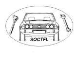
    The tooling fund (SOCTFL) is looking to get their logos professionally redrawn, for use in a number of marketing initiatives.

    Is there anyone who would be willing to donate a couple of hours of their time to help?

    You might also want to suggest some improvements to the design ...

    Current logo attached.

    PaulT
    Attached Files

    #2
    imported post

    Paul, I think a new "logo" would definately help. Shouldn't be too difficult for someone with the necessary tools. I picture of a Stag embedded in the logo I think would be an advantage.

    Comment


      #3
      imported post

      Hi Paul

      I have just given this to my daughter to look at, she is doing a Graphic design Degree at the moment, she was not impressed with the current one so hopefully she can come up with something better, she is going to have a go later in the week, I will let you know when she has got something


      MickL

      Comment


        #4
        imported post

        I agree with Terry, and the existing SOC logo top left would make a good start, with Tooling Fund Limited (I presume) integrated.

        The hind legs are a start of an F, and the front ones L. However, Tooling Fund are the most important words, so maybe TF or Tooling Fund could be incorporated into the Stag logo somehow.

        What was the original reason and choice to use the 'tick' and would the company still like this included in the new design? Also, why blue and red?

        Andy

        Comment


          #5
          imported post


          Just an idea for starters

          ps I'm not a graphic designer (as if you hadn't guessed)

          Comment


            #6
            imported post

            My Brother did a Graphic Design degree a few years ago. I have dropped him an email to see if he is interested.

            Rgds

            Dave

            http://www.stagwiki.com | http://parts.stagwiki.com (Under Development)

            Comment


              #7
              imported post

              mickl wrote:
              Hi Paul

              I have just given this to my daughter to look at, she is doing a Graphic design Degree at the moment, she was not impressed with the current one so hopefully she can come up with something better, she is going to have a go later in the week, I will let you know when she has got something


              MickL
              Hi Mick - thanks for the prompt response. Looking forward to see what she produces.

              PaulT

              Comment


                #8
                imported post

                yabbox wrote:
                I agree with Terry, and the existing SOC logo top left would make a good start, with Tooling Fund Limited (I presume) integrated.

                The hind legs are a start of an F, and the front ones L. However, Tooling Fund are the most important words, so maybe TF or Tooling Fund could be incorporated into the Stag logo somehow.

                What was the original reason and choice to use the 'tick' and would the company still like this included in the new design? Also, why blue and red?

                Andy
                Hi Andy

                We are keen to keep the tick as the SOCTFL 'tick' is hopefully linked to quality parts (a bit like a kite mark). Not so sure of the reasoning being blue and red, and certainly would not see an obstacle to it not being blue/red.

                PaulT

                Comment


                  #9
                  imported post

                  Dave, Greenstag, Terry - nice try ... keep them coming.

                  Comment


                    #10
                    imported post

                    How about this one Stag title and tick!
                    Attached Files

                    Comment


                      #11
                      imported post

                      Try again with this one!
                      Attached Files

                      Comment


                        #12
                        imported post

                        John love it!!!

                        Comment


                          #13
                          imported post

                          I have had a go myself using the 3D model I knocked up for my Avatar. Unfortunatley the geometry of the body has gone kaput, but you get the idea! I am away for the next couple of weeks so won't have the oppertunity to fix it for a while!

                          Rgds

                          Dave

                          Attached Files
                          http://www.stagwiki.com | http://parts.stagwiki.com (Under Development)

                          Comment


                            #14
                            imported post

                            Dave thats stunning

                            Comment


                              #15
                              imported post

                              Russell wrote:
                              Dave thats stunning
                              Computers are good but you have to remember its a logo and has to appear mostly on a white background. D4's gets my vote so far. Keep 'em coming!

                              Al

                              Comment

                              canli bahis siteleri bahis siteleri ecebet.net
                              Chad fucks Amara Romanis ass on his top ?????????????? ???? ?????? ?????? ? ??????? fotos de hombres mostrando el pene
                              güvenilir bahis siteleri
                              Working...
                              X